TABLE OF CONTENTS
- Automatic/Manual Screen Scaling:
- Browser Size:
- Setting the Custom Screen Resolution:
- Matching your DAKOS, Screen, and Monitor/TV Resolution:
- Using Font Size to Make Your Screen Fit Your Display:
- Helpful Articles:
When using a non-DAKOS device, like a Tablet, a Smartphone, a Smart TV, etc., your Screens will look different from device to device. This is because there are limitations of the built-in browser on these devices. Knowing these limitations will help you to be able to design your Screen to fit your display of choice. Here are some helpful tools and suggestions to get this to work for you.
NOTE: These steps will also work with DAKOS devices when you need to use smaller resolutions. Check out the sections Matching your DAKOS, Screen, and Monitor/TV Resolution to see how to match resolutions, and Using Font Size to Make Your Screen Fit Your Display below to see how to make your Screen fit smaller resolutions.
Automatic/Manual Screen Scaling:
With your Paid Subscription and our Custom Screens, we have now included the option to automatically or manually set your Screen's resolution. By default, all new Screens created after February 24th, 2026, will be set to Automatic, while all screens that existed before this will remain in Manual, unless you change it.
The new Automatic setting will set your screen to the highest resolution for your selected Aspect Ratio, then it will scale your screen automatically to fit the size of your Browser or DAKOS display. For example, with the 16:9 Aspect Ratio, your Screens Resolution will be 4K (3840 x 2160 pixels). This means that you will not have to manually set the resolution to match the limitations of your device, as explained below. If you prefer the Manual controls and wish to set the resolution manually, the rest of this article will explain how to do this and supply you with information to make a screen fit within these resolutions.
To change between Automatic and Manual resolutions, open your Custom Screen Editor, click on the Gear Icon in the upper right corner, and select Automatic or Manual as seen below:

Save your changes, and you will be ready to design your Screen.
IMPORTANT:
If your Non-DAKOS Display is hung in Portrait Orientation, and you have to use the Custom CSS to rotate your screen, the Automatic Scaling function will not work for you. This is because the Browser on your Display is still in Landscape Orientation, and it is being tricked into rotating the image. Displays that have Accelerometers that automatically change browser orientation to Portrait, i.e. Tablets and Smartphones, and do not need the Custom CSS to rotate the screen, will work with this new feature.
For now, if you have to use the Custom CSS from our article Display Rotation for non-DAKOS Devices to change the orientation on your Non-DAKOS display, use the manual option and the steps below to display your screen.
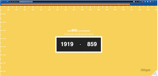
Browser Size:
When using a non-DAKOS device, you will be limited to the Maximum resolution their browser will support. For example, the Amazon Fire TV and Firestick limit their browsers, both built-in and downloaded, to a maximum resolution of 960x540. Our article Use DAKboard on a Fire TV or Firestick explains this fully and shows you how to get the best performance out of such a device.
Setting the Custom Screen Resolution:

From this window, you can set options for your Screen, including its resolution. All of these options are available for both DAKOS and non-DAKOS devices. These options are detailed below for you:
- Screen Name: Set a custom name to identify the screen
- Orientation: This will allow you to change the Orientation from Landscape to Portrait. NOTE: This change will not control your Display; it will only affect the way your Orientation appears in the editor. For DAKOS devices you will also need to change the orientation in the Device settings (see our article Rotate a Display to Portrait or Landscape to learn how to do this) while with non-DAKOS devices, you will need to use Custom CSS to trick the browser into displaying it in Portrait mode (see our article Screen Rotation for non-DAKOS Devices to see how to do this).
- Screen Scaling: This will allow you to set either Automatic or Manual Screen Scaling. See the section above called Automatic/Manual Screen Scaling for more details.
- Aspect Ratio: This will allow you to choose one of the preset or custom ratios to help it fit your screen.

- Resolution: This allows you to select one of the preset resolutions for your selected Aspect Ratio, or allows you to enter a custom Resolution if you select the Custom Aspect Ratio.
- Font: This can be used to set the Default font for the entire Screen. Each block can have its font changed as well, and will override this entry for that block.
- Language: This will allow you to set the Default language for your DAKboard Screen.
NOTE: This will not change the language of the Linked accounts, only those items generated by the DAKboard Screen itself. For example, you will need to change the language of your Google Calendar to get it to use the language you want on your Display.
- Timezone: This will set the timezone for your Screen and all its related blocks. Some blocks will override this (like your Datetime block), and some services may override this as well (like ICS/iCal calendar links). For the blocks that override this, you will have the option to set time zones in their Editor under the Settings or Format tabs. For services overriding this, you may need to set the timezone on your Display or in the service itself to get the correct time. See our article How to Set the Timezone for more details on this.
- Time Format: This will set the time format for the Screen. As with the timezone, some blocks and services may override this. Setting this in these blocks or services should correct this if you experience it.
To set a Custom Resolution, click the Aspect Ratio dropdown and select Custom. This will allow you to enter the resolution you found for your browser in the previous section, as seen below:

Once your changes are made, click Save to apply them to your Screen. From here, it is now simply designing your Screen and changing Font Sizes to make it work on your Display.
Matching your DAKOS, Screen, and Monitor/TV Resolution:
When trying to get your Screen to look the same on your Monitor/TV when using a DAKOS device, like the CPUs, you need to know a few things. First, what is the maximum resolution of your Monitor/TV? The second is, what is your Screen's resolution set to? Third, what is your DAKOS Display's resolution set to? To utilize the maximum resolution, all three things should match.
Start by checking your Monitor/TV's manual and determine its maximum resolution. This is your target, as you cannot exceed this value. Next, use our article Set Display Resolution to set your DAKOS resolution as close as possible to this maximum resolution without exceeding it.
NOTE: The Auto setting works with most Monitors and TVs that have CEC and will allow the DAKboard to set itself to the maximum resolution for your Monitor/TV. This, however, may fail on older devices. It is better to select from the Resolution options.
Finally, use the section above called Setting the Custom Screen Resolution to set the Screen Resolution to match your Display's resolution.
Using Font Size to Make Your Screen Fit Your Display:
With a little work and using Custom Font sizes, you can make any size screen smaller to fit any size browser. For example, below we have one screen set at 1080p (1920x1080), and the other is set at 960x540 (the resolution for a Fire TV.


Can you tell which is which? Here is a hint: the one at the Bottom is the Custom Screen. The only difference is the Font size for each of the blocks.
For the Screen on the Bottom, we set the fonts in each block in the Block Editor, under the Formatting tab. Here you will have some preselected common font sizes, but you can also type in custom font sizes if you prefer. Just click on the Font Size dropdown to see the options, or type the font size you want to use into the space provided. For example, if you want an extremely large clock, you can type 100 into the font size selector instead of stopping at 60, or if you want it extremely small, you can type a 1 in instead of the preset 5. Please note that some custom Font sizes may not be recognized by the Display you are using. You may have to stick with one of the preset Fonts, or it may not work at all. See below:

Experimenting with the Fonts and their sizes will help with any DAKboard Screen to get it to fit your Display. Make sure to save your changes and refresh your Display to apply them. You can go beyond the Present fonts by simply typing the value you want into the space provided.
Helpful Articles:
Having trouble? See if these articles help.
How to Use the Custom Screen Live Editor
Advanced Features of the Custom Screen Editor
How to use a non-DAKOS Device as a Display
Rotate a Display to Portrait or Landscape
Display Rotation for non-DAKOS Devices